
페이지에서 새로고침 없이 사용자에게 정보를 표시하거나 입력 받을 때는 어떻게 해야 할까요? 정말 여러가지 방법이 있지만 부트스트랩의 “모달”은 이를 정말 쉽게 구현할 수 있게 도와줍니다.
모달이란?
모달창은 웹 페이지에서 부분적으로 띄워진 독립적인 창으로, 주로 정보를 표시하거나 사용자로부터 추가 입력을 받을 때 사용되는 팝업 형태의 UI 요소입니다.
모달 만들기
https://getbootstrap.com/docs/5.3/components/modal/
위의 링크로 들어가 원하는 모달창 코드를 복사합니다.
모달창을 띄울 버튼 태그는 원하는 위치에 넣습니다.
모달 div는 하단에 추가 합니다.
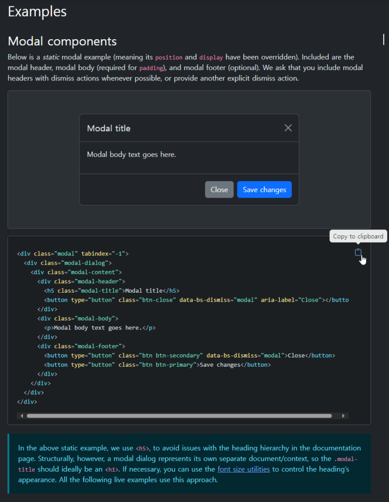
<!-- Button trigger modal -->
<button type="button" class="btn btn-primary" data-bs-toggle="modal" data-bs-target="#exampleModal">
  Launch demo modal
</button>

<!-- Modal -->
<div class="modal fade" id="exampleModal" tabindex="-1" aria-labelledby="exampleModalLabel" aria-hidden="true">
  <div class="modal-dialog">
    <div class="modal-content">
      <div class="modal-header">
        <h1 class="modal-title fs-5" id="exampleModalLabel">Modal title</h1>
        <button type="button" class="btn-close" data-bs-dismiss="modal" aria-label="Close"></button>
      </div>
      <div class="modal-body">
        ...
      </div>
      <div class="modal-footer">
        <button type="button" class="btn btn-secondary" data-bs-dismiss="modal">Close</button>
        <button type="button" class="btn btn-primary">Save changes</button>
      </div>
    </div>
  </div>
</div>
코드 설명
버튼 코드data-bs-toggle="modal" 및 data-bs-target="#exampleModal" :
- 해당 버튼이 모달을 토글하도록 지정합니다.
#exampleModal은 모달의 ID입니다.
모달 코드
fade
- 모달이 나타날 때 페이드 인/아웃 효과를 제공합니다.
모달 내용 수정
modal-body 태그 안에 모달창에 넣을 내용을 넣습니다.
이번 예제에서는 아래와 같이 입력을 받는 모달창을 만들어 보겠습니다.
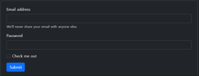
위와 같은 입력은 form 태그로 구현을 하는데요.form 태그 예제는 Forms · Bootstrap v5.3 (getbootstrap.com) 에서 가져옵니다.
원하는 form 태그를 modal-body 클래스 태그 안에 넣습니다.
<form>
  <div class="mb-3">
    <label for="exampleInputEmail1" class="form-label">Email address</label>
    <input type="email" class="form-control" id="exampleInputEmail1" aria-describedby="emailHelp">
    <div id="emailHelp" class="form-text">We'll never share your email with anyone else.</div>
  </div>
  <div class="mb-3">
    <label for="exampleInputPassword1" class="form-label">Password</label>
    <input type="password" class="form-control" id="exampleInputPassword1">
  </div>
  <div class="mb-3 form-check">
    <input type="checkbox" class="form-check-input" id="exampleCheck1">
    <label class="form-check-label" for="exampleCheck1">Check me out</label>
  </div>
  <button type="submit" class="btn btn-primary">Submit</button>
</form>
코드 설명
mb-3 클래스는 여백을 조절하는 클래스 입니다.mb는 margin-bottom을 나타내며, 숫자 3은 여백의 크기를 나타냅니다
input type 속성과 이름을 쓰임에 맞게 변경하여 사용합니다.
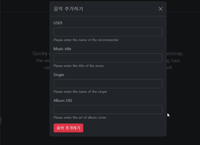
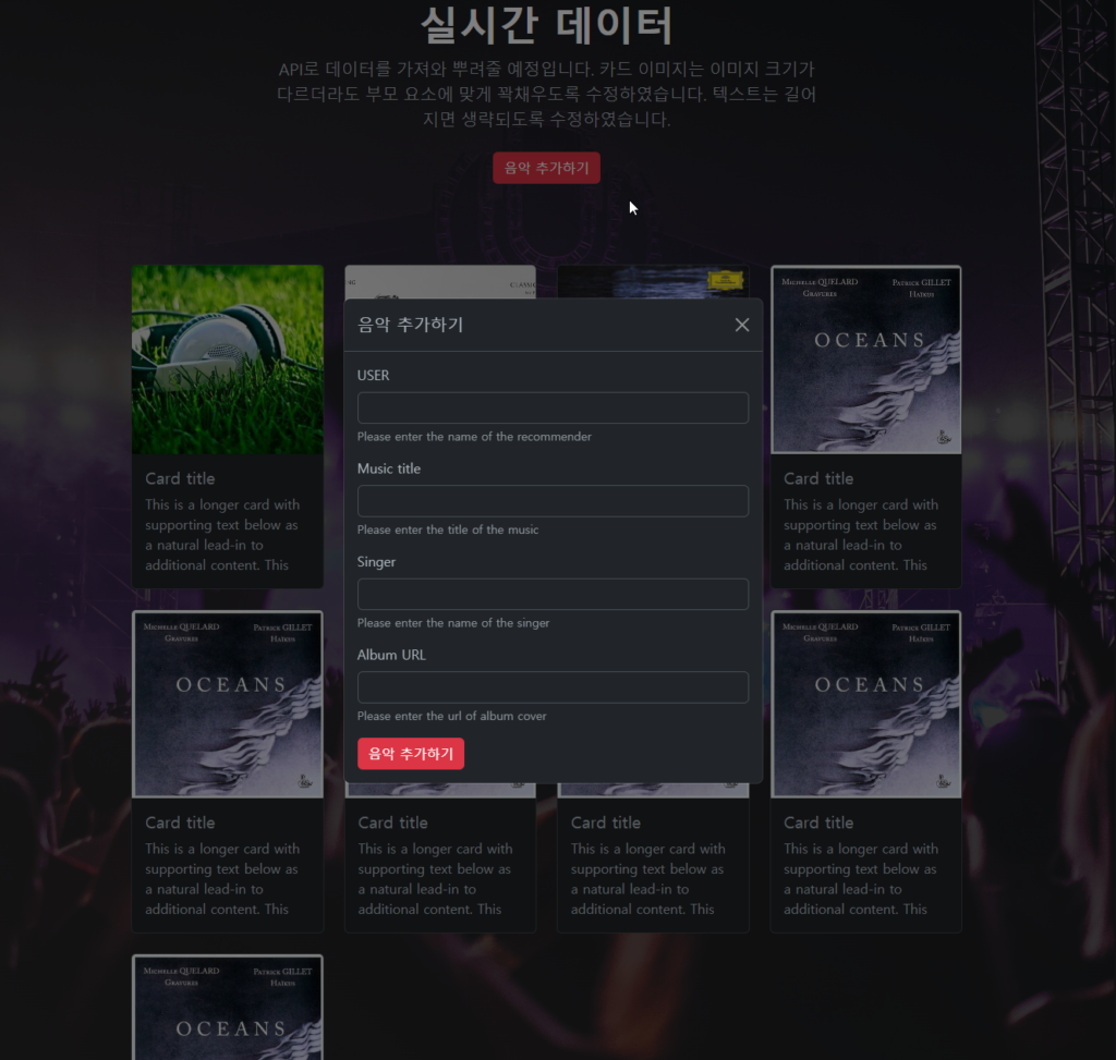
결과
저는 input 태그를 추가하고 “text” 타입으로 변경하고 하단의 버튼을 삭제 했습니다.
모달을 수직 중앙에 띄우기
모달창은 기본적으로 상단에 띄워집니다. 모달창을 브라우저의 수직 중앙에 띄우기 위해서는 modal-diaglog 클래스에 modal-dialog-centered를 붙여줍니다.
<!-- Vertically centered modal -->
<div class="modal-dialog modal-dialog-centered">
  ...
</div>

<!-- Vertically centered scrollable modal -->
<div class="modal-dialog modal-dialog-centered modal-dialog-scrollable">
  ...
</div>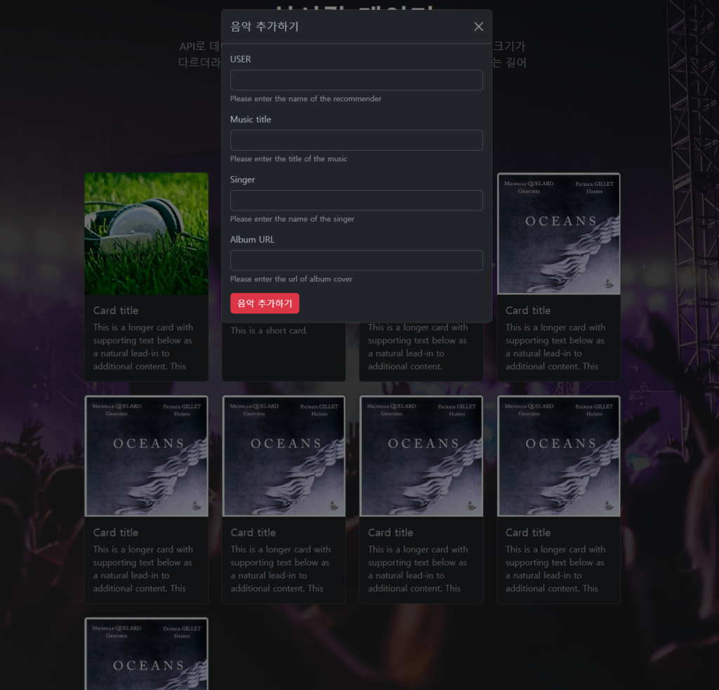
Static backdrop : 배경을 눌러도 꺼지지 않는 모달창
기본 모달창은 모달창을 닫기버튼을 누르지 않아도 모달창 외부를 누르면 자동으로 종료되었습니다. Static backdrop 모달창은 모달창 닫기 버튼을 누르지 않는 이상 모달창이 종료되지 않습니다.
<!-- Button trigger modal -->
<button type="button" class="btn btn-primary" data-bs-toggle="modal" data-bs-target="#staticBackdrop">
  Launch static backdrop modal
</button>

<!-- Modal -->
<div class="modal fade" id="staticBackdrop" data-bs-backdrop="static" data-bs-keyboard="false" tabindex="-1" aria-labelledby="staticBackdropLabel" aria-hidden="true">
  <div class="modal-dialog">
    <div class="modal-content">
      <div class="modal-header">
        <h1 class="modal-title fs-5" id="staticBackdropLabel">Modal title</h1>
        <button type="button" class="btn-close" data-bs-dismiss="modal" aria-label="Close"></button>
      </div>
      <div class="modal-body">
        ...
      </div>
      <div class="modal-footer">
        <button type="button" class="btn btn-secondary" data-bs-dismiss="modal">Close</button>
        <button type="button" class="btn btn-primary">Understood</button>
      </div>
    </div>
  </div>
</div>
스크롤링 모달
클래스에 modal-dialog-scrollable을 넣음으로써 스크롤링을 추가할 수 있습니다.
<!-- Scrollable modal -->
<div class="modal-dialog modal-dialog-scrollable">
  ...
</div>
모달 사이 토글
모달창의 버튼을 클릭하면 해당 모달창이 꺼지고 새로운 모달창이 띄워지게 할 수 있습니다.
data-bs-target 및 data-bs-toggle 속성을 배치하여 여러 모달 간을 전환합니다.
예를 들어 이미 열려 있는 로그인 모달 내에서 비밀번호 재설정 모달을 전환할 수 있습니다.
여러 모달을 동시에 열 수는 없습니다. 이 방법은 단순히 두 개의 개별 모달 사이를 전환합니다.
<div class="modal fade" id="exampleModalToggle" aria-hidden="true" aria-labelledby="exampleModalToggleLabel" tabindex="-1">
  <div class="modal-dialog modal-dialog-centered">
    <div class="modal-content">
      <div class="modal-header">
        <h1 class="modal-title fs-5" id="exampleModalToggleLabel">Modal 1</h1>
        <button type="button" class="btn-close" data-bs-dismiss="modal" aria-label="Close"></button>
      </div>
      <div class="modal-body">
        Show a second modal and hide this one with the button below.
      </div>
      <div class="modal-footer">
        <button class="btn btn-primary" data-bs-target="#exampleModalToggle2" data-bs-toggle="modal">Open second modal</button>
      </div>
    </div>
  </div>
</div>
<div class="modal fade" id="exampleModalToggle2" aria-hidden="true" aria-labelledby="exampleModalToggleLabel2" tabindex="-1">
  <div class="modal-dialog modal-dialog-centered">
    <div class="modal-content">
      <div class="modal-header">
        <h1 class="modal-title fs-5" id="exampleModalToggleLabel2">Modal 2</h1>
        <button type="button" class="btn-close" data-bs-dismiss="modal" aria-label="Close"></button>
      </div>
      <div class="modal-body">
        Hide this modal and show the first with the button below.
      </div>
      <div class="modal-footer">
        <button class="btn btn-primary" data-bs-target="#exampleModalToggle" data-bs-toggle="modal">Back to first</button>
      </div>
    </div>
  </div>
</div>
<button class="btn btn-primary" data-bs-target="#exampleModalToggle" data-bs-toggle="modal">Open first modal</button>
Full screen 모달
.modal-dialog에 modal-fullscreen를 더함으로써 모달창이 화면 전체에 띄워지게 할 수 있습니다.
반응형으로 특정 화면 사이즈 이상에서는 일반 모달창을 이하에서는 전체화면 모달창을 띄울 수도 있습니다.
| Class | Availability |
|---|---|
.modal-fullscreen | Always |
.modal-fullscreen-sm-down | 576px |
.modal-fullscreen-md-down | 768px |
.modal-fullscreen-lg-down | 992px |
.modal-fullscreen-xl-down | 1200px |
.modal-fullscreen-xxl-down | 1400px |
<!-- Full screen modal -->
<div class="modal-dialog modal-fullscreen-sm-down">
  ...
</div>
참고할 만한 글